Thursday, December 20, 2012

Week 14 Visual Techniques

1. Guggenheim Museum, Bilbao, Spain
Image source

Techniques:

  • Sharpness
  • Randomness
  • Juxtaposition 
  • Depth
  • Activeness
  • Spontaneity
  • Complexity 
  • Asymmetry
  • Boldness


2. Sofa by Charles and Ray Eames

Image source

Techniques:

  • Symmetry
  • Regularity
  • Balance
  • Economy
  • Consistency
  • Stasis


Both of these designs show a strong understanding of visual techniques, delivering a strong visual message. The Guggenheim presents a fresh and modern design language, it is very bold and consequentially unforgettable as well as polarizing. The architect Frank Gehry used asymmetrical forms in direct contrast with more conventional architectural design. Activeness in form makes the building feel alive and organic, full of passion and excitement. On the other side of the spectrum, this sofa designed by Charles and Ray Eames shows a drastically different design language that is very strong in it's own right. The visual message in this case follows the function of the piece. Economy is perhaps the strongest visual technique, every line has a distinct purpose and anything superfluous is left out. The repetition of rectangular forms centers the message, it is a calming form, in direct contrast to the excitement of the Guggenheim.

Thursday, December 13, 2012

Week 13 Contrast

Lack of contrast leading to a poor design- Coda sedan


The lack of defining contrast in the Coda Sedan causes the design, while not overly unpleasant, to ultimately fail. To put it simply, the design lacks visual sharpening, it is boring. Without any form of visual excitement, or any other cues to the electric drive train of the car, it simply fades into the background, and has not been noticed by buyers. While the design is more or less symmetrical and balanced, it falls into the category of weak design which is ambiguous. Any number of visual techniques could have been utilized to fix this, adding curves could have given it a warmer, more organic appearance, or in the other direction, with more angles and severe lines to appear more aggressive. In this case, occupying the middle ground did not work. 


Effective use of contrast- Kia GT concept

The Kia GT concept comes off as visually successful because of the designer's use of contrast. Contrast in shape is used between the organic, coke bottle shape of the lower half of the car, specifically contrasting the hard edged character lines defining the sides, and the transition from the sides to the back of the car. Contrast in color is used to add definition to the metal band that runs along the roof, as well as details such as using two contrasting metals for the wheel design, adding more visual interest. Even the headlight and brake light designs utilize contrast in color, shape and tone. This all comes together to create a dynamic and visually interesting design, emphasizing the sporty nature of the car. 

Thursday, December 6, 2012

Week 12 Movement/ Motion

Surreal Storage Cabinet – Vault by Dahna Laurens

This cabinet uses implied movement in order to draw the eye around the piece, making it interesting and unique from all different angles. The designer uses expectation in the cubic forms appearing as they might in an instant roll off the main form. This is also direction, as the forms appear to be moving in different directions. There is implied motion in the legs, as they grow thinner towards the bottom.  The use of diagonal lines throughout makes the viewer feel unsteady. The use of imbalance in the forms further emphasizes this effect. There is also contrast in textures between the wood and the metal forms, emphasizing the negative space under the main form. Complexity of form when combined with visual imbalance in this case, makes a very visually busy and interesting statement.

Staircase on the top floor of the San Francisco Main Library, designed by James Ingo and Cathy Simon


This is a picture I took of the staircase leading to the top floor of the Main Library. Diagonal lines are used almost to the point of excess, creating the feeling of motion. The center support structure starts smaller towards the bottom, and bigger and visually heavier towards the top, creating visual imbalance. The sweeping movement of the stairs draws the eye up or down the staircase, depending on perspective. There is contrast in shape and scale between the various different forms used to create the structure. The sweeping form at the top echoes the stairs below it, and is at once complex, and visually unstable, as the structure supporting it appears too small to be strong enough, as if it could fall down at any moment. The Gestalt Law of Continuation is also utilized, as many of the forms create gestures that are implied to go on beyond our field of sight.


Thursday, November 29, 2012

Week 11 Dimension/ Depth/ Space/ Scale

Google Earth 3D


Google's Earth service creates the illusion of depth and three dimensional space using many different techniques. Linear perspective is perhaps the most obvious and useful tool, however this is all done using software, because the original pictures come mostly from satellite, such as when viewing Google's maps site. The lack of aerial perspective, or the fact that the contrast and color saturation stay uniform even when comparing objects in the horizon to those close up, gives an unnatural appearance, and makes the image look odd, like there is no atmosphere. Texture gradient is also used, with more details on objects close to the view point, however, even this application is limited, because in this case the effect is distinctly put into levels of close up, to middle, to far away, limiting it's effectiveness. Relative size in the buildings in the foreground compared to the distance is utilized effectively. Also, familiar size in objects such as the cars on the bridge gives the viewer a better idea of the scale of the objects they are looking at. Overall, it is impressive that through software, these images were created. Without the tools described, the images would be flat and confusing to the observer. 

Thursday, November 15, 2012

Week 10 Blog Tone and Color

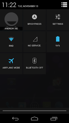
For this week I chose Google's Android 4.2 operating system that was recently brought to market.


Keyboard

Quick Settings


How TONE is operating-
Tone is used very strongly in this operating system, primarily to create a certain style or "feel" that speaks to how advanced it is, as well as unifying different screens. The primary tones are strongly differentiated, with bright cyan, deep blacks and grey tones in between. A strong range of tone presented creates a vivid image.
How TONE is interacting-
Tone most importantly interacts with color, by combining the two, a uniform and flowing style is created. Also, by combining dark tones in the background next to light tones of color for text and icons, this allows for good legibility.
How COLOR is operating-
The colors chosen have meaning and reason, beginning with the continuation of cyan, as blue invokes a feeling of calmness. Also important is the exceptions to the cyan, black, white and grey color scheme in the desk clock screens. The red in this case is symbolic of the function, for example making the alarm text red, or very "alarming" itself.
How COLOR is interacting-
Color interacts strongly with saturation, in that the few bright colors against the mostly black or grey background are highly saturated, making them easier to read and stand out more. This also creates a crisp and vivid imagery throughout. 

Thursday, November 8, 2012

Week 10 Blog- Basic Elements in Automotive Design


  1. Mazda Kazamai Concept - Movement


The concept Kazamai, or dance, gives the appearance of motion even standing still. This is expressed in the curved lines on the doors, the grille, and even the shape and proportion, which use visual trickery to make the appear as if it is tensed up, and ready to pounce. By using organic shapes on an inorganic surface, the designers gave the appearance of movement and life. 
    
 2.   Fiat 500- Shape

The new Fiat 500 uses shape to create a vintage look on a modern vehicle. By using certain cues, such as the round headlights, the appearance is related to the original, even though the two are decades apart, vastly different in size, and on unrelated platforms. Circles are also used in the wheel arches, mimicking the original model, and in the shape of the car, as well as details. 


The Hyundai Veloster uses line in many interesting ways. The character line along the side of the car gives definition, as well as visually shortens and lengthens the car, utilizing visual trickery to make the car better proportioned than it's front wheel drive economy car platform would allow. Another interesting use of line is in the front fascia, with a hard line dividing the grill, and again on the leading edges of the wheel arches, giving a more aggressive look, and suggesting air inlets for the brakes. As well as many details involving line, the overall effect is a car much more aggressive looking than it's actual underpinnings. 

Thursday, November 1, 2012

Week 8- Visual Thinking Research


For this week's assignment, my friend and I both solved puzzles simultaneously. This is the results; her pen was purple, mine green.
 Both of us took about 20 turns to complete the puzzle. The lowest possible was 14. Interestingly enough, both of us started from the outside, and took roughly the same path. The correct pattern begun on the inside and worked it's way out.

 "The Cat"
 This was an example of pattern recognition. On both this puzzle and the previous one, my friend and I both worked our way from top to bottom, and, on this puzzle, left to right, just like reading language. She got he correct number, 20, but I missed the overall eyes. Both of us used a method to check off the ones we had completed. This also was an example of grouping.

Thursday, October 11, 2012


Week 6 Blog
Visual Perception 1-
Top- Down Visual Processing

This image is the unveiling of the Ford Fusion at the 2012 Detroit Auto Show. Looking at this image from a top- down visual perception, you begin with the context of knowing that the image is going to be a car, or in this case, multiple cars. In the context of the situation, this is the first glimpse of what this new model looks like, so details, as well as overall shape is relevant. Because of the context, the brain can put all of the details together seamlessly. First, the subject is acknowledged, then the shape and overall design, as well as colors, are processed.

Thursday, October 4, 2012

Week 5 Design Success and Failure / Syntactical Guidelines


Volkswagen Up! Lite Concept
Both of these vehicles are attempting the same goal, to make an extremely efficient commuter car
for future cities. However, as far as design goes, the Up! Lite Concept is much more effective. The overall effect of the design is balanced and attractive. Though very small and efficient, it still looks like a 'real' car. Use of accent lines- stress in design, the triangular wedge shape of the car, and proportion give it an attractive, sporty appearance. 


Commuter Cars- Tango

The Tango, on the other hand, is less sucessful, at least visually. It appears to be completely out of balance, with the width in proportion to the height very unbalanced. The design of the car could have appeared more balanced if, for example, the brake lights were used to sharpen the design, and make the car to appear wider than it is, by focusing on vertical design.
Tango image source link

Thursday, September 27, 2012

Week 4 Visual vs Symbolic Language- Veteran


This photo shows a man in military uniform giving a salute, directed at someone off screen. The figure, implied to be a Veteran, is back lit by the sun directly behind him, as well as the American flag flying behind him. The whole scene is set off by a bright blue sky.

Responses:

  • Patriotism
  • Honor
  • Confidence
  • Neatness
  • Bright
Symbols:
  • American flag-  denotes United States, patriotism, and victory.
  • Blue sky- denotes calmness, nature, good, this means things are going well.
  • Veteran- denotes military, support for elders, victory.
  • Salute- denotes ceremony, respect, recognition, and greeting.

The underlying compositional structure shows intention to reinforce the goal of the photograph. This includes having the flag be in motion, creating a sensation of movement, as well as the back lighting effect of the sun behind the Veteran as well as the flag. This back lighting creates a 'halo' effect, implying 'good'. Also, positioning the camera slightly below the subject being photographed makes that  subject, in this case the Veteran, appear to be more powerful, as the viewer is looking up at the subject.


Photo source: http://www.haneylawfirm.com/wp-content/themes/SM/images/us-veteran.jpg

Thursday, September 20, 2012


Week 3 Blog Meaning2


Representational
This advertisement for the Samsung Galaxy SIII shows first and foremost a representation of the phone itself. This representational level of the image gives the viewer a way to identify what is being advertised. In this case, they are trying to sell more than just a phone, they are trying to show that it is almost naturalistic, which is absurd on a basic level, as this is a piece of electronics. The representational aspect of the image is needed to tie the concept together.

Abstract
The leaf and nature images behind the phone, as well as the dandelion image displayed on the phone itself, are meant to bring that feeling of nature and tranquility that the advertisement is selling to the viewer. This is integral, because for each of the levels to make sense with the others, they have to use this level as the primary indication that the phone has a “design inspired by nature” as the advertisement is claiming.

Symbolic
There are symbols displayed on the screen, and the ones picked tend to be skeuomorphic, such as the camera icon appearing as an old film camera, the microphone symbol, as well as the calling icon derived from a corded phone.  This, is just another part of the effort to make the overall appearance simple, further reinforcing the message.


Image source:
Web. Last accessed 9-20-12
<http://cdn.redmondpie.com/wp-content/uploads/2012/06/Galaxy-S-III-video.png>

Thursday, September 13, 2012

Week 2
Meaning 1- Blog Exercise

1. Representation.

This work is called 'The Favorite Cat', by Nathaniel Currier, from 1849- 1850. This shows representation because it is primarily realistic, it realistically portrays what this cat would have looked like. The shape, features and details are all realistic, even though it is not a photograph. This is instantly recognizable as a cat, because all of the form and details are what we expect a cat to look like.

2. Abstraction
This image, from a Trader Joe's bag, shows the progression towards symbolism. Many details are left out and replaced with simpler lines and shading. However, the image remains very easily recognizable, and still appears somewhat realistic. Abstraction, in this case, is going in the direction of symbolic. 

3. Symbolism
This Crossing symbol, taken locally, shows just the most simple outline of a figure walking. This is in order to quickly and simply get the message across that it is safe to walk across. There is a cultural aspect as well, because we have to be trained to know what this means. This is a  universal indication that it is now safe to walk.