

The lack of defining contrast in the Coda Sedan causes the design, while not overly unpleasant, to ultimately fail. To put it simply, the design lacks visual sharpening, it is boring. Without any form of visual excitement, or any other cues to the electric drive train of the car, it simply fades into the background, and has not been noticed by buyers. While the design is more or less symmetrical and balanced, it falls into the category of weak design which is ambiguous. Any number of visual techniques could have been utilized to fix this, adding curves could have given it a warmer, more organic appearance, or in the other direction, with more angles and severe lines to appear more aggressive. In this case, occupying the middle ground did not work.
Effective use of contrast- Kia GT concept
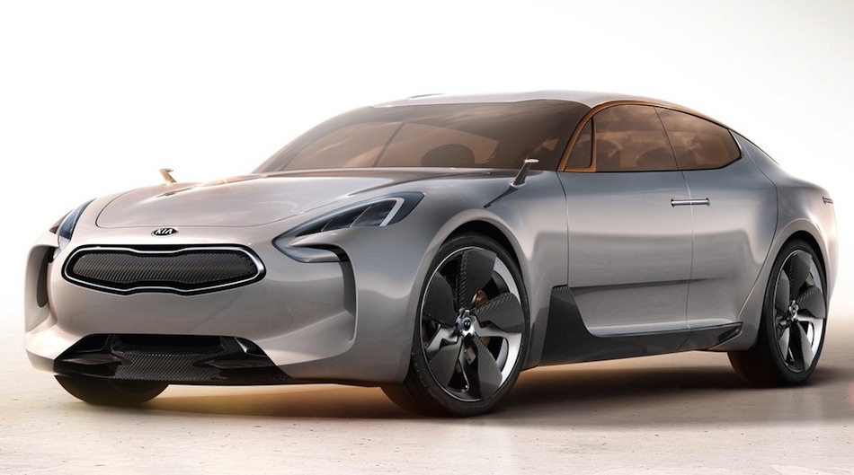

The Kia GT concept comes off as visually successful because of the designer's use of contrast. Contrast in shape is used between the organic, coke bottle shape of the lower half of the car, specifically contrasting the hard edged character lines defining the sides, and the transition from the sides to the back of the car. Contrast in color is used to add definition to the metal band that runs along the roof, as well as details such as using two contrasting metals for the wheel design, adding more visual interest. Even the headlight and brake light designs utilize contrast in color, shape and tone. This all comes together to create a dynamic and visually interesting design, emphasizing the sporty nature of the car.
No comments:
Post a Comment