For this week I chose Google's Android 4.2 operating system that was recently brought to market.
Keyboard |
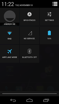
| Quick Settings |
Tone is used very strongly in this operating system, primarily to create a certain style or "feel" that speaks to how advanced it is, as well as unifying different screens. The primary tones are strongly differentiated, with bright cyan, deep blacks and grey tones in between. A strong range of tone presented creates a vivid image.
How TONE is interacting-
Tone most importantly interacts with color, by combining the two, a uniform and flowing style is created. Also, by combining dark tones in the background next to light tones of color for text and icons, this allows for good legibility.
How COLOR is operating-
The colors chosen have meaning and reason, beginning with the continuation of cyan, as blue invokes a feeling of calmness. Also important is the exceptions to the cyan, black, white and grey color scheme in the desk clock screens. The red in this case is symbolic of the function, for example making the alarm text red, or very "alarming" itself.
How COLOR is interacting-
Color interacts strongly with saturation, in that the few bright colors against the mostly black or grey background are highly saturated, making them easier to read and stand out more. This also creates a crisp and vivid imagery throughout.
No comments:
Post a Comment