Thursday, November 29, 2012

Week 11 Dimension/ Depth/ Space/ Scale

Google Earth 3D


Google's Earth service creates the illusion of depth and three dimensional space using many different techniques. Linear perspective is perhaps the most obvious and useful tool, however this is all done using software, because the original pictures come mostly from satellite, such as when viewing Google's maps site. The lack of aerial perspective, or the fact that the contrast and color saturation stay uniform even when comparing objects in the horizon to those close up, gives an unnatural appearance, and makes the image look odd, like there is no atmosphere. Texture gradient is also used, with more details on objects close to the view point, however, even this application is limited, because in this case the effect is distinctly put into levels of close up, to middle, to far away, limiting it's effectiveness. Relative size in the buildings in the foreground compared to the distance is utilized effectively. Also, familiar size in objects such as the cars on the bridge gives the viewer a better idea of the scale of the objects they are looking at. Overall, it is impressive that through software, these images were created. Without the tools described, the images would be flat and confusing to the observer. 

Thursday, November 15, 2012

Week 10 Blog Tone and Color

For this week I chose Google's Android 4.2 operating system that was recently brought to market.


Keyboard

Quick Settings


How TONE is operating-
Tone is used very strongly in this operating system, primarily to create a certain style or "feel" that speaks to how advanced it is, as well as unifying different screens. The primary tones are strongly differentiated, with bright cyan, deep blacks and grey tones in between. A strong range of tone presented creates a vivid image.
How TONE is interacting-
Tone most importantly interacts with color, by combining the two, a uniform and flowing style is created. Also, by combining dark tones in the background next to light tones of color for text and icons, this allows for good legibility.
How COLOR is operating-
The colors chosen have meaning and reason, beginning with the continuation of cyan, as blue invokes a feeling of calmness. Also important is the exceptions to the cyan, black, white and grey color scheme in the desk clock screens. The red in this case is symbolic of the function, for example making the alarm text red, or very "alarming" itself.
How COLOR is interacting-
Color interacts strongly with saturation, in that the few bright colors against the mostly black or grey background are highly saturated, making them easier to read and stand out more. This also creates a crisp and vivid imagery throughout. 

Thursday, November 8, 2012

Week 10 Blog- Basic Elements in Automotive Design


  1. Mazda Kazamai Concept - Movement


The concept Kazamai, or dance, gives the appearance of motion even standing still. This is expressed in the curved lines on the doors, the grille, and even the shape and proportion, which use visual trickery to make the appear as if it is tensed up, and ready to pounce. By using organic shapes on an inorganic surface, the designers gave the appearance of movement and life. 
    
 2.   Fiat 500- Shape

The new Fiat 500 uses shape to create a vintage look on a modern vehicle. By using certain cues, such as the round headlights, the appearance is related to the original, even though the two are decades apart, vastly different in size, and on unrelated platforms. Circles are also used in the wheel arches, mimicking the original model, and in the shape of the car, as well as details. 


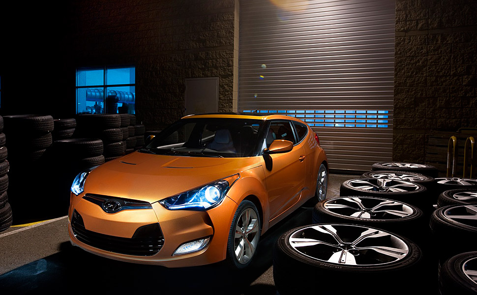
The Hyundai Veloster uses line in many interesting ways. The character line along the side of the car gives definition, as well as visually shortens and lengthens the car, utilizing visual trickery to make the car better proportioned than it's front wheel drive economy car platform would allow. Another interesting use of line is in the front fascia, with a hard line dividing the grill, and again on the leading edges of the wheel arches, giving a more aggressive look, and suggesting air inlets for the brakes. As well as many details involving line, the overall effect is a car much more aggressive looking than it's actual underpinnings. 

Thursday, November 1, 2012

Week 8- Visual Thinking Research


For this week's assignment, my friend and I both solved puzzles simultaneously. This is the results; her pen was purple, mine green.
 Both of us took about 20 turns to complete the puzzle. The lowest possible was 14. Interestingly enough, both of us started from the outside, and took roughly the same path. The correct pattern begun on the inside and worked it's way out.

 "The Cat"
 This was an example of pattern recognition. On both this puzzle and the previous one, my friend and I both worked our way from top to bottom, and, on this puzzle, left to right, just like reading language. She got he correct number, 20, but I missed the overall eyes. Both of us used a method to check off the ones we had completed. This also was an example of grouping.